June 8th, 2026
What's New in June 2026
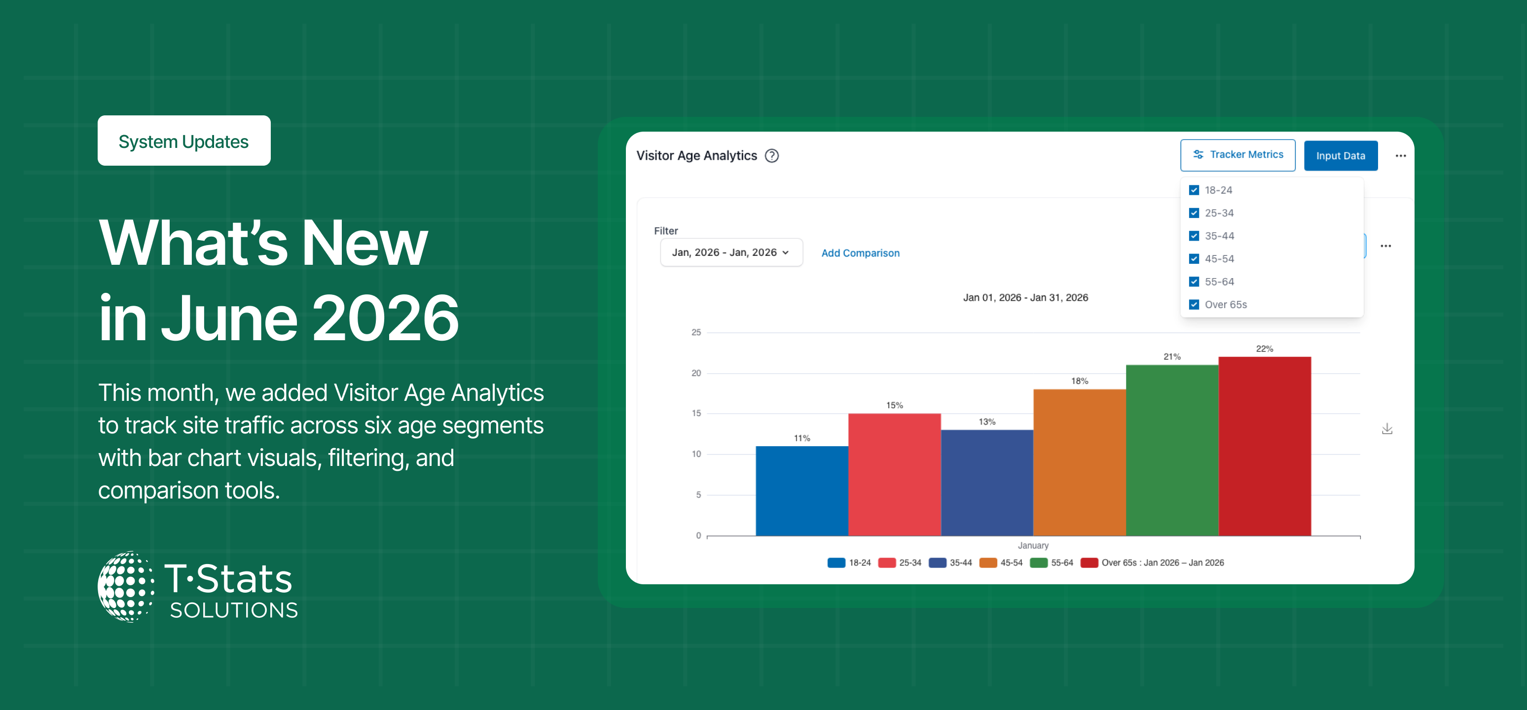
We've made several updates this month to enhance the power and usability of T-Stats Solutions. These updates brought focus on chart refinements and improved data integrity. Here's what's new:'
ENHANCEMENTS
Import Validation Now Enforces Single Provider Constraints
What is the change: Improvement of the import process to validate that import files comply with single-provider tracker configurations.
What is the impact: Prevents incorrect data from being imported into single-provider trackers, improving data integrity and reducing the risk of inflated sample sizes in the analysis view.
Chart Bars Now Display in the Same Order as Tracker Metrics
What is the change: Updated tracker chart rendering so that bar order consistently reflects the order of metrics as defined in the Tracker Metrics configuration in Settings.
What is the impact: Charts are now consistent with tracker configuration, making it easier to match chart output to the configured metric order.
Pie Chart Slices Now Show Percentage Labels Only
What is the change: Removed raw data value labels from pie chart slices, leaving only the percentage (%) label displayed on each slice
What is the impact: Reduces visual clutter on pie charts and makes percentage data easier to read at a glance.
BUG FIXES
Pie Chart Now Displays the Active Filter as the Chart Title
What is the change: Fixed an issue where the pie chart title did not update when a provider filter was applied.
What is the impact: Users can now clearly identify which filter is active when viewing a filtered pie chart.
Pie Chart Now Shows a "No Data" Message When No Data Is Available
What is the change: Fixed an issue where the pie chart continued to render even when no data was available for the selected filter or period.
What is the impact: Users are now clearly informed when no data is available, preventing misinterpretation of an empty chart.
Chart Legend Now Correctly Assigns Distinct Colours to Each Dataset
What is the change: Fixed an issue where the chart legend was not correctly mapping colours to search criteria, causing multiple datasets to appear in the same colour.
What is the impact: Each dataset is now rendered in a distinct colour with the legend correctly identifying each one, restoring the ability to meaningfully compare datasets.
Thanks for using T-Stats! We're committed to making the platform better for you and your businesses every month. Your feedback helps shape these improvements — keep it coming!